
Playing With Color Palettes in Interior Design
Textures and patterns are important facets of interior design, but it’s color that really pulls everything together to create a well-designed, comfortable space. Color palettes are such fun to play with, but they can be a bit intimidating to dive right into. Allow us to restore the joy and open exploration of color palette play by passing on a few beginner’s tips from top interior designers. They’re exactly what you’ll need to get started toying around with all the color possibilities your own space holds!
1.) Remember The Color Wheel
Most people don’t know that “tertiary colors” even exist. We all know the three primary colors (red, blue, and yellow) and the three secondary colors (orange, purple, and green). Tertiary colors are the six shades that can be made when primary and secondary colors are mixed. The color wheel is comprised of, at least, these 12 colors. Their shades are made by adding either white, black, or gray paint.

2.) Just Pick One
Not really, but really! Experts have two suggestions for choosing a color when you're truly at a loss. Either take advantage of the color wheel by choosing one of those 12 shades you’re most drawn to, or choose a color scheme from the largest pattern in the space you’re trying to design. Is there a super cute blue and gold rug in the middle of the room? Perfect! Find that color blue on the color wheel and go from there.
3.) Which Colors, Where?
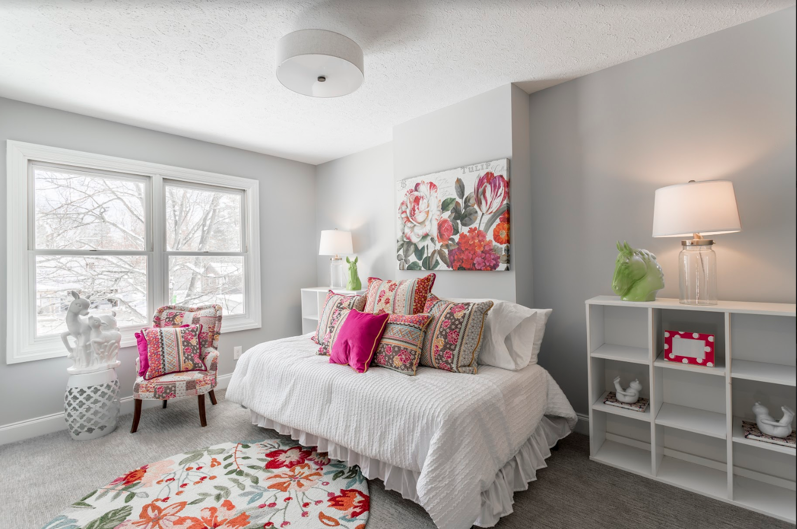
Experts recommend you start your color scheme in formal areas of the home, such as the living room, dining room, and entryway. This is helpful because, once you’ve chosen that color palette, you can take one of those colors and apply it to another room in a toned down shade. For example, a bright royal blue couch in the living room might become a deeper midnight hue on an accent wall in a bedroom. Just be sure to reference your handy color wheel often! Colors will always look good side-by-side if they originate from the same column on a color wheel.
4.) The All-Important Rule of 60-30-10
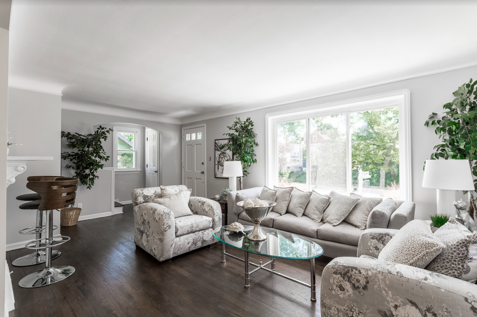
You know those color palette suggestions in the paint aisles at home improvement stores that have one big square of a dominant color and two additional squares of complementary colors? That’s the basis of this rule. Professional interior designers recommend that 60% of the components of a space should be the dominant color (walls), 30% should be the secondary color (typically upholstery), and 10% should be the accent color (accessories). So, as long as you can choose three shades from the color wheel that you think look good together and use these ratios, you have a no-fail magic formula for good color-palette design!
The above is some of the most fundamental information you should have before starting a successful journey into color palette creativity. But, professional interior designers apply a far vaster array of design principles when crafting a space suited specifically for your vision and needs. If you’re interested in partnering with an experienced team of interior design specialists to transform your space or even just stage your home for sale, we’d love to hear from you! Simply, reach out on our website or call us at 216-685-7555 to make Living Beautifully your reality!